Close


Eye-catching color pairings transform into a signature pattern for the brand.
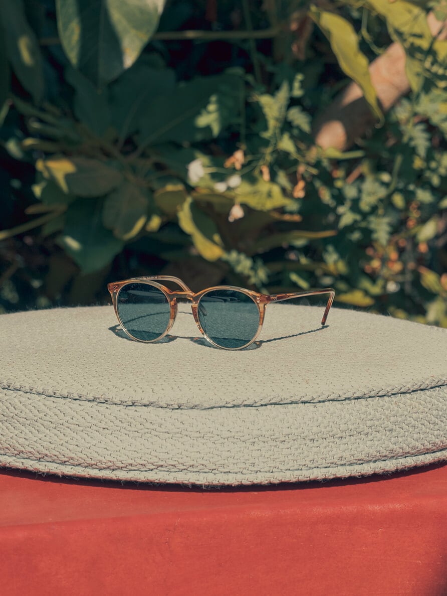
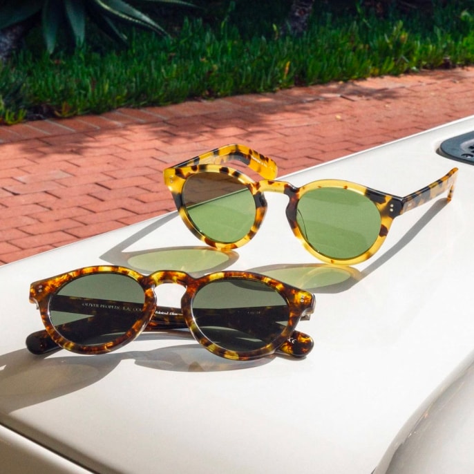
As with all the premium, hand-crafted acetate that shapes Oliver Peoples products, VSB requires closer consideration. VSB designates one style of translucent, stratified design that’s applied to numerous colors. Much like the swooping natural rock formations of Antelope Canyon, lines inside the acetate create textured gradient. This particular patterning mesmerizes with layers of depth and dimension. Used to greatest effect in thicker frames, the VSB acetate allows colors to fan outward in the frames with fluidity—and light refraction and reflection emphasize it all.
In fact, VSB is an acronym for Vintage Surf Bi-Color. Each word lends substantial meaning to the final product range. The ‘Vintage’ in VSB references the design team’s use of archival colors—from research to implementation. Surf does more than nod to the California brand’s history; it creates a dynamic visual of water cresting—and the variation of color within. Finally, Bi-Color simplifies layering to two stacks: patterning of top and translucent acetate on the bottom. Sometimes a hard line separates both; other times, the transition is seamless.
Shop now
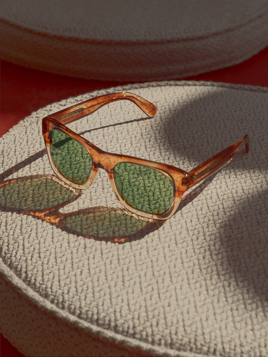
Green C lenses accent the structured, sophisticated Keenan in Honey VSB.
Shop now
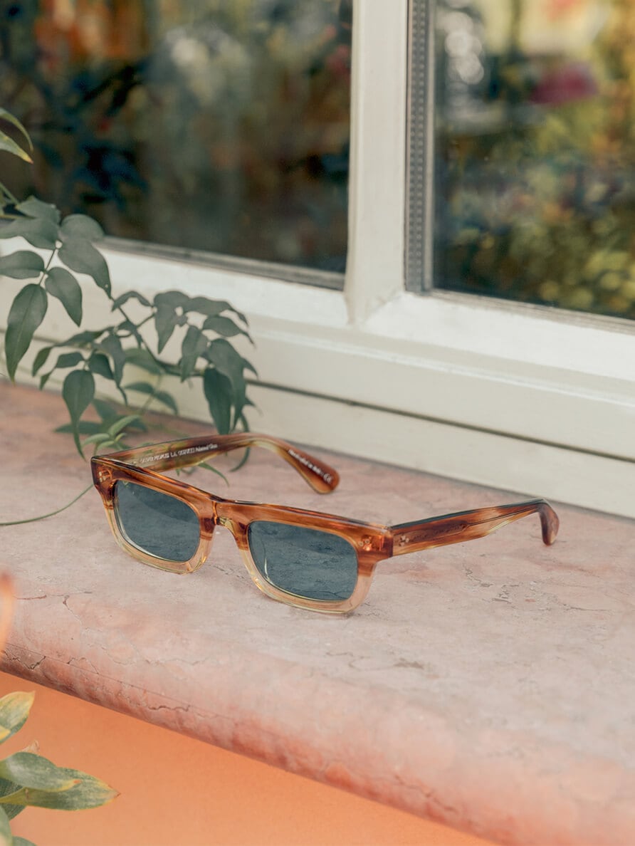
Edgy and architectural, the Jaye in Honey VSB pairs perfectly with Teal Polar lenses.
Shop now
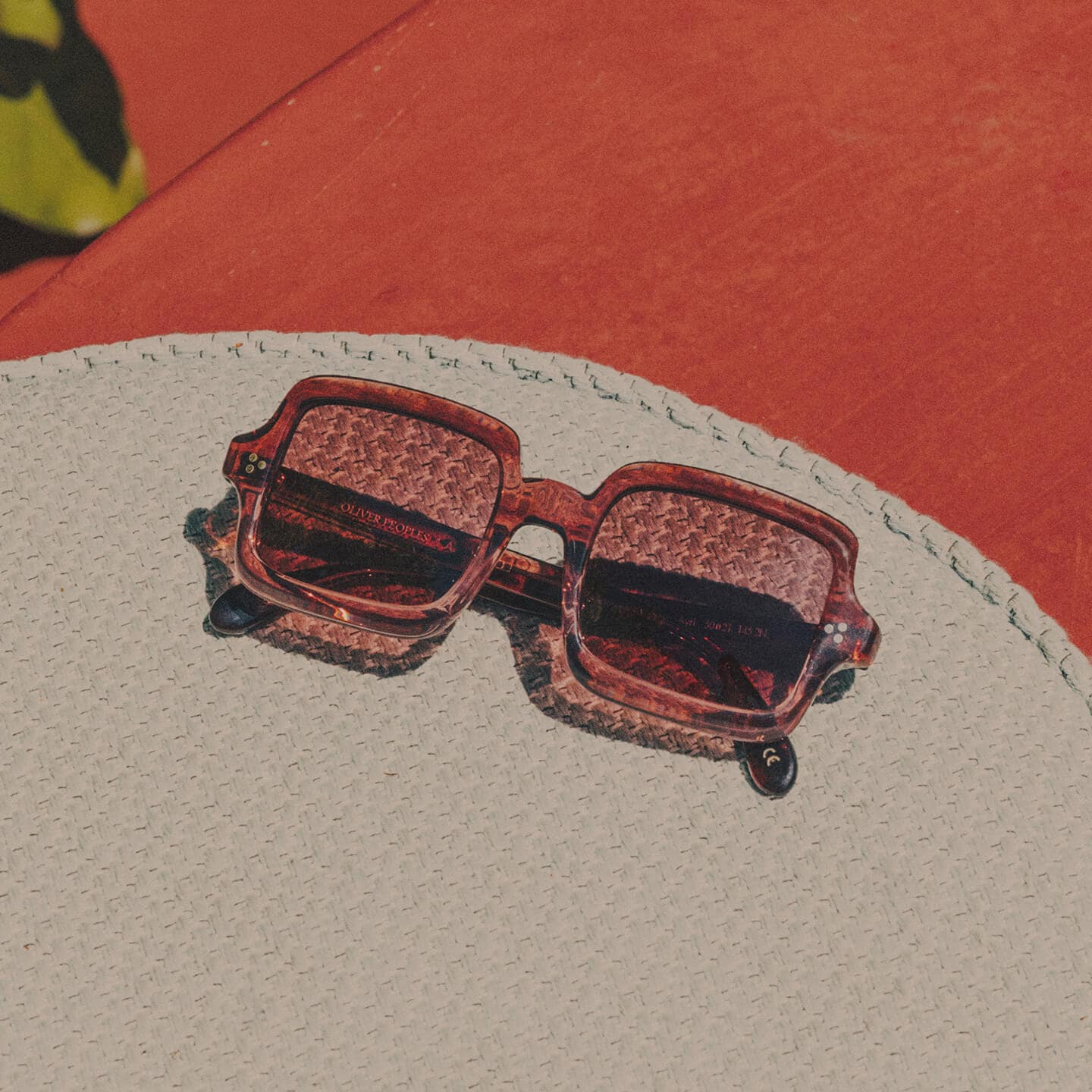
One of the most iconic Oliver Peoples silhouettes, the shape composing the O’Malley Sun glow in Honey VSB with Teal Polar lenses.
To find the perfect color for VSB stratification, Oliver Peoples designers must not only secure the perfect translucent base but nearby hues that work well together. This gradient and the levels of translucency and saturation inside give the frames an elegant fade throughout. The pattern as a whole must speak to the wearer, not just one of the individual colors comprising it. And, in turn, these unified colors must work with the skin tone beneath.
VSB frames focus on all-natural colorways and often glow with familiarity. For instance, the teal pattern mimics the shifting colors of crystalline water—balancing blues of lakes and oceans. VSB in honey appears like sun-rays gliding through a canyon at dusk, blending together neutral golden tones. Rose, which acts much like blush for the wearer’s eyes, reflects not one but all the petal colors of a bouquet. These captivating scales accentuate the attributes of their owner. VSB, as a pattern, is undeniably an active expression of tone—and a true demonstration of Oliver Peoples care for color.

Shop now
Retro, rounded Rishell frames in Teal VSB make a bold statement, whether they’re worn or waiting to be.
The distinct design process behind it all begins with narrowing color options to a palette that is guaranteed to work on the face. Of course, there’s seasonal variation—with fall or winter naturally skewing darker and spring and summer headed brighter, lighter and more colorful. Each season, Oliver Peoples designers love to experiment with colors, looking to art, fashion, and nature for inspiration—and pulling tones from which they can create their own custom colors. Designers also dedicate time to playing with eye-catching iterations that consumers could gravitate toward if seen on displays or in trays.
Often designers request ten to fifteen colors closely congregated in the spectrum as the base translucent option. After the VSB pattern is developed, they pick the best of the best to bring to market. With near endless hues at their disposal, it all comes down to this choice. The final factor in color development correlates to the theme designers are trying to incorporate into the collection, too. Finally, theme, frame, and color unite for the perfect VSB pair.
Words: David Graver
Photos: Cerruti Draime


Craftsmanship
Exquisite Vision: Proprietary Sun Prescription Lenses

Craftsmanship
Solid Gold

Craftsmanship

